 | |
 | Shortened from Southern Pacific Railroad Internal Communication. |
 | Taken from the logo, which represents the arm and hammer of Vulcan, the Roman god of fire and metalworking, which was adopted from the Vulca Spice Mills. |
 | Founder Dave Thomas named the company after his daughter Melinda, who was nicknamed Wendy. |
 | Shortened from Government Employees Insurance Company. |
 | Named after a character in Herman Melville’s Moby Dick. |
 | Taken from the nickname of founder Adlof Adi Dassler. His brother, Rudolf Rudi Dassler,went on to found his own shoe company called Ruda, which later became Puma. |
 | Shortened from Service Games of Japan, which originally imported pinball machines into American bases in Japan. |
 | From the founders’ names, Harold 'Matt' Matson and Elliot Handler. |
 | Named for the coca leaves and kola nuts originally used as flavouring. |
 | Named after founder Glen Bell. |
 | Taken from the Japanese word for when an opponent’s pieces are in danger of being captured in the game Go.(Not unlike the term check in chess. |
 | Combination of the Latin word veritas, which means truth, and the word horizon. |
 | Named from the digestive enzyme pepsin. |
 | Suggested to founder Richard Branson by a friend who claimed they were “complete virgins at business.” |
 | From the Danish leg godt, which means to play well. |
 | Stylized form of rhebok, which is an African antelope. |
 | Named for Adobe Creek, which ran behind the house of co-founder john Warnock. |
 | Changed from U-Tote’m in 1946 when new 7:00 am until 11:00 pm hours into effect. |
 | Originally part of the Echo Bay Technology Group. The URL EchoBay.com was already taken by a mining company based out of Echo Bay, Nevada. |
 | Named after the company’s first product, the ever-sharp pencil. |
Showing posts with label Corporate Logo. Show all posts
Showing posts with label Corporate Logo. Show all posts
Monday, May 21, 2012
Brand Name, Behind the Scene

Monday, January 9, 2012
IBM Logo Evolution & History


International Business Machines Corporation
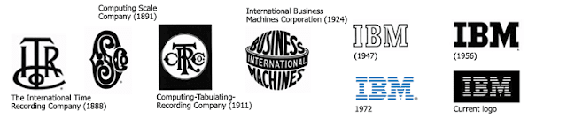
In 1911. The International Time Recording Company (ITR) and the Computing Scale Company (CSC) merged and they became appears as Computing-Tabulating-Recording Company (CTR). After few years later, when their business was booming, which made the company’s logo too restricted, and they formally changed their name to International Business Machines Corporation (IBM) in 1924 (14 Feb) and adapting the globe version of the IBM logo. Font: Rocco Letters

When the globe shape IBM logo failed to retain their caring image, the company changed its IBM logo to the newly adapted font Beton Bold and previous glove was altered to the simple lettering of IBM in 1947. In May 1956, Tom Watson Jr. took over the company as CEO after his father passed away and in steps to exemplify the new management and technological era, he hired the famous graphics designer Paul Rand, who replaced outline shaped logo by a more solid, grounded IBM logo, font City Medium.



When the globe shape IBM logo failed to retain their caring image, the company changed its IBM logo to the newly adapted font Beton Bold and previous glove was altered to the simple lettering of IBM in 1947. In May 1956, Tom Watson Jr. took over the company as CEO after his father passed away and in steps to exemplify the new management and technological era, he hired the famous graphics designer Paul Rand, who replaced outline shaped logo by a more solid, grounded IBM logo, font City Medium.

In 1972, Paul Rand introduced a new version of IBM logo, solid letters were replaced by horizontal strips, which is representing Speed & Dynamism and rendering an even corporate image and goodwill.

Now watch the total journey:

Figure out More »
Monday, December 19, 2011
Audi Logo Evolution & Secrets


Audi AG



Audi AG is one of the most renowned automobile manufacturing company, which deals with gorgeous and luxurious cars.
In 1932, four independent motor-vehicle manufactures Audi, DWK, Horch and Wanderer merge themselves to create a giant car manufacturer in Germany. After that they joined with NSU at 1969 and the present Audi AG is the root of these companies.

The four ring symbolizes the ancient four companies margining and conveying the constant efforts to strengthen bonds with their customers by manufacturing. The new logo introduced in the fall of 2009 on the 100th anniversary of audi, improves on the 3-dimensional aspect of the ring.

The name of the company is sort of a pun on ‘hoerch’, German for ‘hear’, named after its creator ‘Augush Horsh’.

Apple, BMW, Canon, Google, IBM, Microsoft, Firefox
Subscribe to:
Posts (Atom)